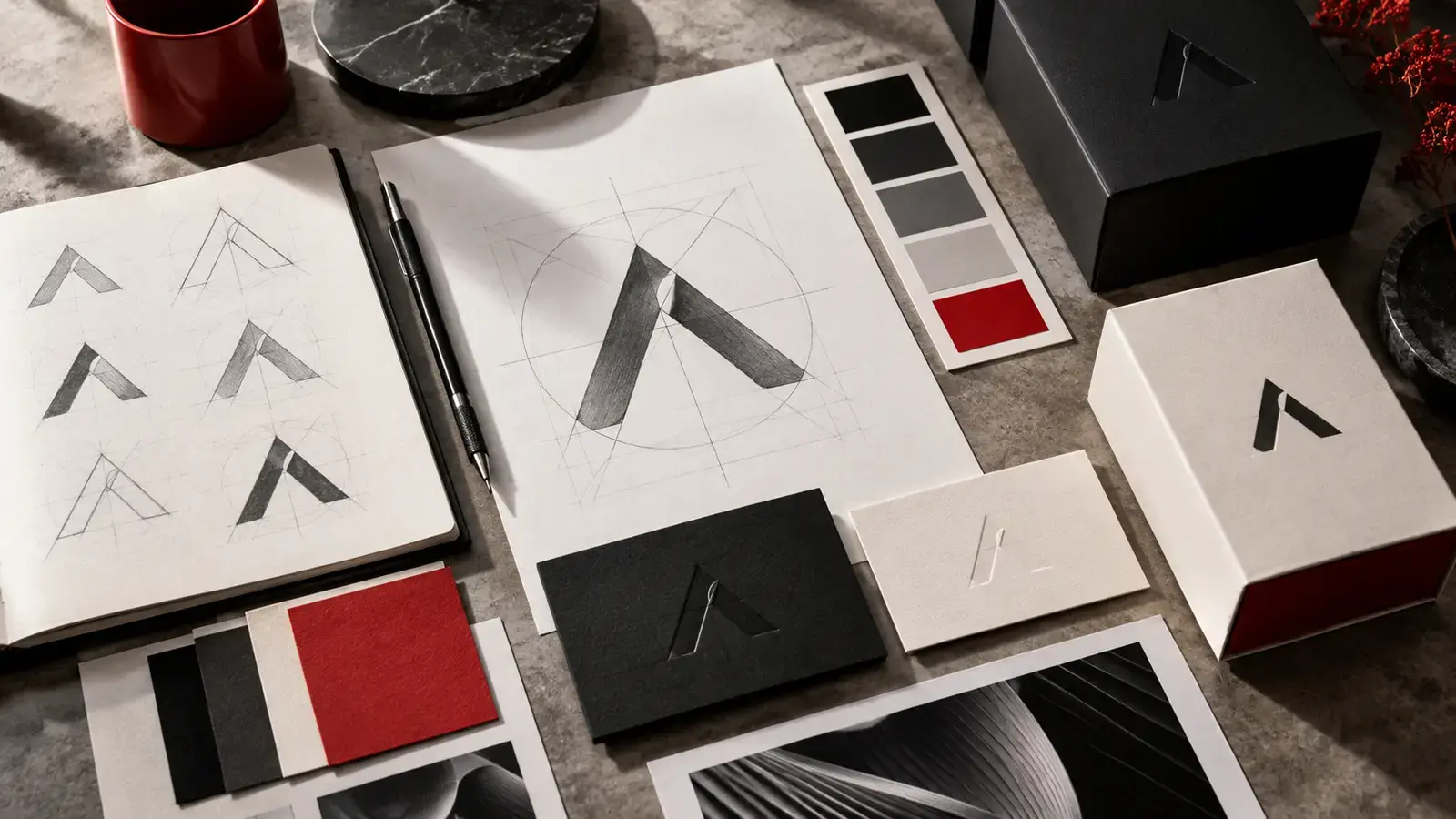
The logo is the beginning, not the whole result
A good logo must be recognizable, technically usable and understandable in both small and large formats. However, the symbol alone will not determine how the website, offer, packaging, car sticker or post on the social network will look.
What constitutes a visual identity
- basic and additional versions of the logo,
- company colors with exact values for screen and print,
- typography and heading hierarchy,
- style of photography, illustrations and icons,
- graphic elements, grid and composition rules,
- sample applications on the most commonly used materials.
Why a company needs a design manual
The design manual removes guesswork. It determines the protection zone of the logo, its minimum size, permissible backgrounds and prohibited modifications. Thanks to this, each supplier can prepare an output that acts as part of a single brand.
Identity saves time and money
If the colors, fonts and templates are ready, every other material is created faster. The company does not have to decide anew what it should look like for every flyer, post or presentation. The number of corrections is reduced and the brand appears more trustworthy.
How to start
First of all, you need to name who the brand serves, what distinguishes it and what impression it should create. Only then comes the visual concept. The result should not only be a nice picture, but a practical system ready for the web, social networks, print and production.
Identity must be verified in real formats
The proposal is to be tested from a small icon on a mobile phone to a large sign on a building. Readability, sufficient contrast, the functionality of the single-color version, and the right materials for digital and print are important.
A hands-on test on a business card, website, packaging and sticker often reveals more than just presenting the logo. The company thus gets an identity that can be reliably used every day and further developed.